[MyDaily = Reporter Kim Jong-guk] Nike is facing scrutiny after observers identified design problems with national team jerseys it produced ahead of the CONCACAF World Cup.
Nike unveiled the new national team kits on the 19th of last month. The company supplies uniforms to a wide range of countries, including South Korea, Brazil, the Netherlands, the United States, England and France. During last month’s international window, several Nike-backed teams wore the kits planned for the CONCACAF World Cup, and those matches exposed a recurring design flaw.
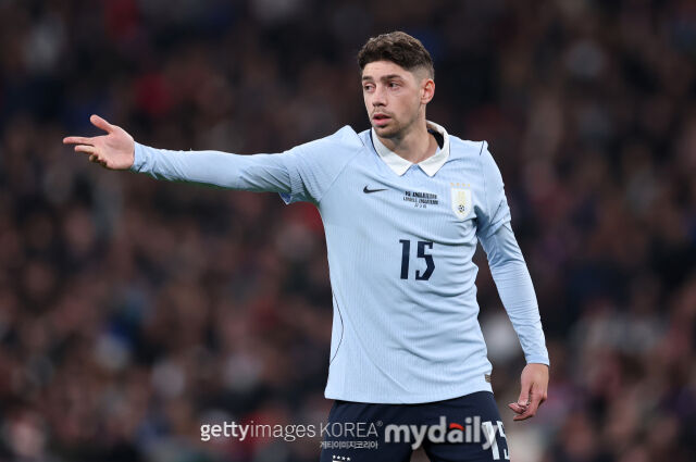
On the 11th, the BBC reported that Nike is investigating a design issue affecting the jerseys several teams — including England — will wear at this summer’s World Cup. Observers noticed the shoulder area of shirts worn by England, France and Uruguay appeared to bulge outward. The problem showed up in both player-issue shirts and replica kits sold to fans.
A Nike spokesperson told The Guardian: "During the recent international window we found a minor issue on the shoulder area of some national team jerseys. It does not affect performance, but it is unsatisfactory from an aesthetic standpoint. We have always upheld the highest standards, and this product did not meet those standards. We are working quickly to resolve the issue for players and fans. Every jersey should reflect the care, accuracy and pride appropriate for competition."
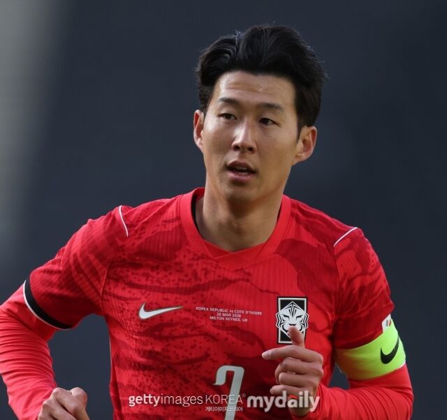
South Korea’s home kit received generally positive reviews. Football gear outlet FootyHeadlines graded Nike’s new designs last month and gave Korea’s home jersey an A, placing it just behind S-rated home kits from Norway, Brazil and the United States. By contrast, Korea’s away kit drew sharper criticism and received a C.
When Nike unveiled the South Korean kits last month, the company said: "The home jersey draws on the baekho, the white tiger symbolizing Korea’s resilience and guardianship, visually expressing the team’s toughness, unity and the explosive attacking power that comes at decisive moments. We applied a modern interpretation of a tiger camouflage pattern to create a dynamic visual that blends heritage and modernity. We also used a custom typeface that combines traditional Korean calligraphy with Western design elements to sharpen the team’s identity. The away kit expands the ambush narrative. Inspired by the concentrated energy and explosive momentum of a flower blooming, it visually expresses Korea’s unique dynamic energy. A bold violet color unites elegance and strength to showcase the competitiveness of Korean football."