 |
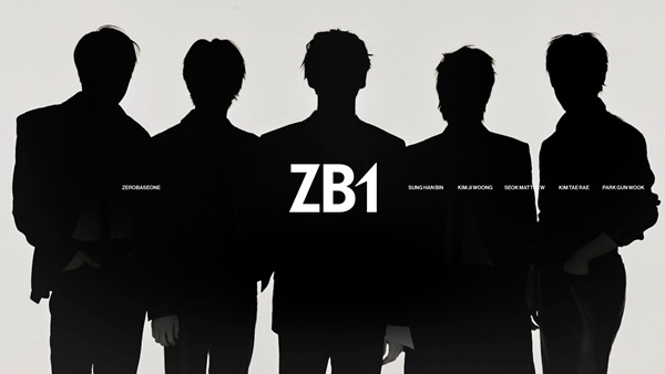
| ZEROBASEONE / Photo: Provided by WakeOne |
The refreshed identity for ZEROBASEONE (Seong Han-bin, Kim Ji-woong, Seok Matthew, Kim Tae-rae, Park Geon-uk) preserves the group's core character while presenting a cleaner, more solid aesthetic. The redesign reworked strokes and forms to sharpen and define the group's visual signature.
The symbol mark—a zero (0) that wraps around a one (1)—serves as a visual shorthand for the group's cohesion. By emphasizing the \"1\" and introducing an upward sweep and sense of velocity, the emblem communicates the group's ongoing drive and upward momentum.
The full logo illustrates, in symbolic terms, how distinct personalities converge to form the whole. The compact mark, rendered as \"ZB1,\" employs extending strokes to convey lift and speed, suggesting a structure built for future expansion.
As the first team signature revealed since the group's relaunch, the logo builds on ZEROBASEONE's established identity while distilling the direction they intend to take going forward.
The accompanying silhouette imagery echoes the logo's message. Even within a restrained visual treatment, the silhouettes project presence and hint at a more mature, purposeful direction.
With this refresh, ZEROBASEONE aims to reaffirm the idea of a new beginning and to heighten anticipation for the activities they have planned.
[Sports Today reporter Im Si-ryeong ent@stoo.com]
\"Your closest, most fun news\" © Sports Today